case study 01 — UX + Research
Global Navigation Redesign & Search Usability Testing
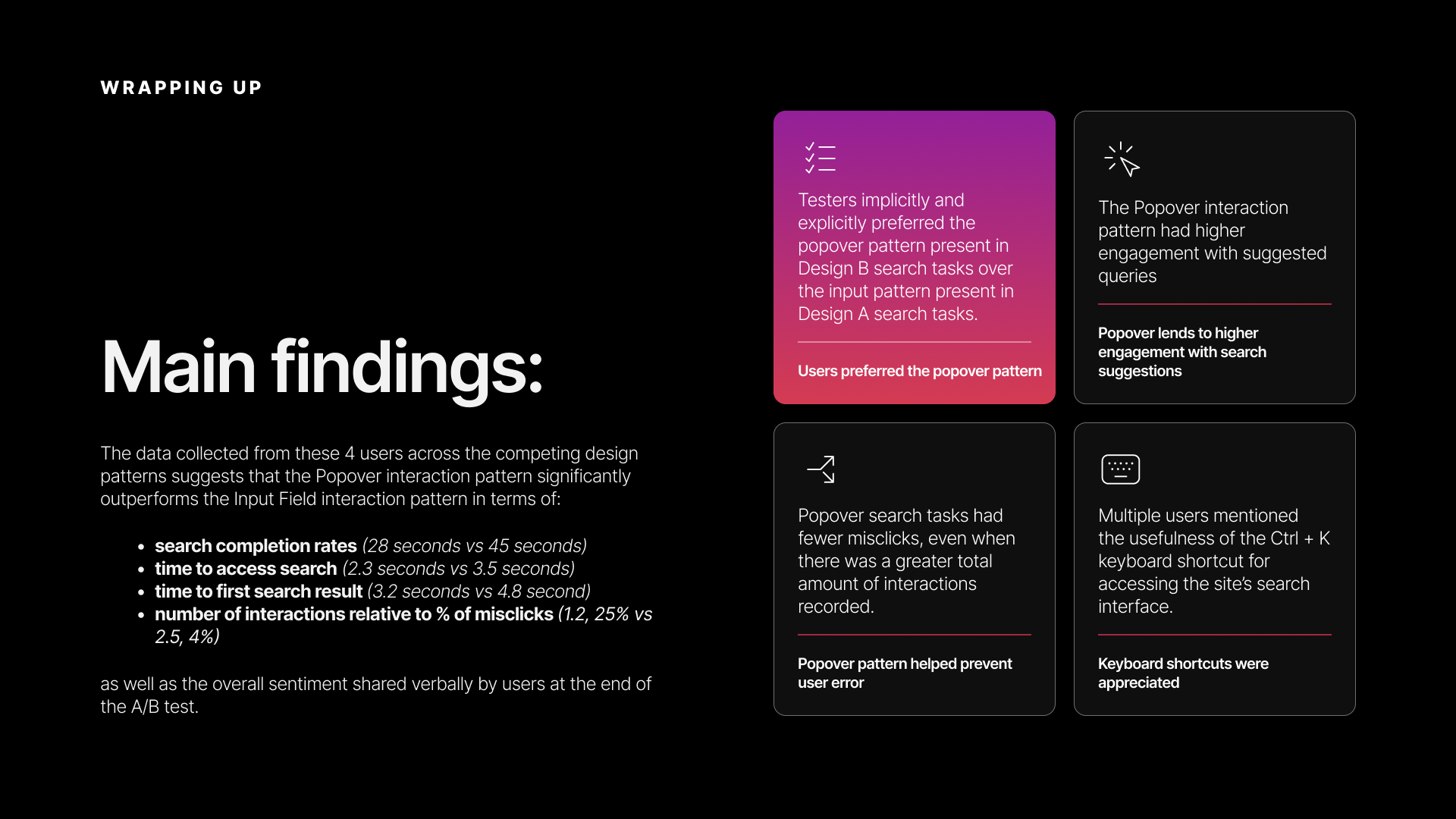
The help center's navigation was designed for a smaller product suite — when Webex grew to dozens of products, I redesigned the structure to scale and ran a comparative usability test that showed the new search pattern was 38% faster.
The Situation
help.webex.com's global navigation had 8 items. The Webex product suite had grown well beyond what 8 items could represent — AI Agent, Contact Center, Devices, Control Hub, and a constellation of sub-products all competing for discoverability. Users landing on the help center had to already know what they were looking for, because the navigation wasn't structured to help them browse.
Search was similarly constrained. The existing pattern was a text input field embedded in the global nav bar — functional, but it navigated users away from their current page to a dedicated results page. For a help center where users are often deep in product-specific documentation, that context switch was friction. And the suggested queries were based on common search strings, not actual article titles — so the suggestions pointed users toward popularity, not relevance.
Competitive research across 10+ enterprise help sites confirmed these were solvable problems. 100% of competitors maintained search as a primary or secondary item in their global navigation. 70% provided categorized, filterable search results. 80% paginated results to prevent cognitive overload. The patterns existed — we just needed to apply them within our design system and content architecture.
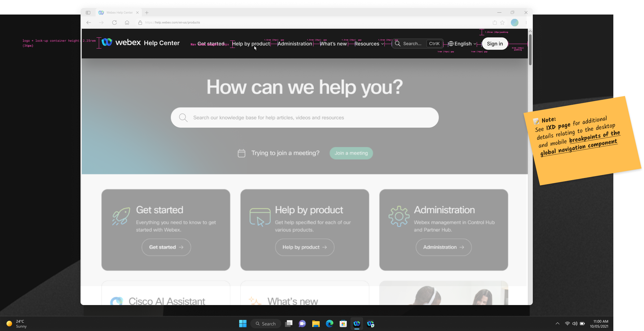
The redesigned global navigation — signed-out state annotated with layout and spacing properties for engineering handoff
My Role & Scope
I led the interaction design for both the global navigation restructure and the search experience redesign, including competitive research, Figma design specifications, interactive prototyping, usability test design and facilitation, data analysis, and the stakeholder presentation of findings. I worked alongside a colleague who owned the front-of-house areas like the homepage and landing pages — my scope was the search experience and article pages specifically. Duration: roughly FY25 Q1 through Q2, with the test results presented in January 2025.
The Approach
Competitive research
I audited 10+ competitor help sites to establish baseline patterns and identify opportunities. Key findings:
- Search visibility: 100% maintained search as a primary/secondary nav item — persistent and always accessible
- Result categorization: 70% provided multiple orders of search results tied to content structure, with category-based filtering
- Pagination: 80% segmented results into paginated lists to prevent cognitive overload (though explicit page numbering was split 50/50)
- Rich media in results: Only 20% surfaced visual assets alongside result items — an outlier worth noting but not prioritizing
- Sorting vs. filtering: Only 20% surfaced sorting options separate from filtering — another outlier that confirmed filtering was the higher-value pattern
This research established that our search experience was behind baseline expectations, not ahead of them. The redesign wasn't aspirational — it was catching up to table stakes.
Navigation restructure: 8 to 23 options
The global nav redesign expanded available navigation options from 8 to 23 — exposing the full product suite as structured navigation rather than hiding it behind search. More options is a cost, not a win; the design work was paying that cost without overwhelming the bar. The key structural changes:
- Addition of the Webex logo in the header for consistent brand identity
- "Help by product" mega-menu — a dedicated dropdown exposing the full product suite (Webex App, Meetings, Calling, Webinars, Slido, Webex Suite, Events, Devices, Contact Center, Control Hub) with product-specific iconography I worked with our director of product design to define
- "For administrators" → "Administration" — relabeling to align with actual user mental models
- "Adoption" → "Resources" menu — restructured to house adoption materials, support links, and community resources under a clearer umbrella
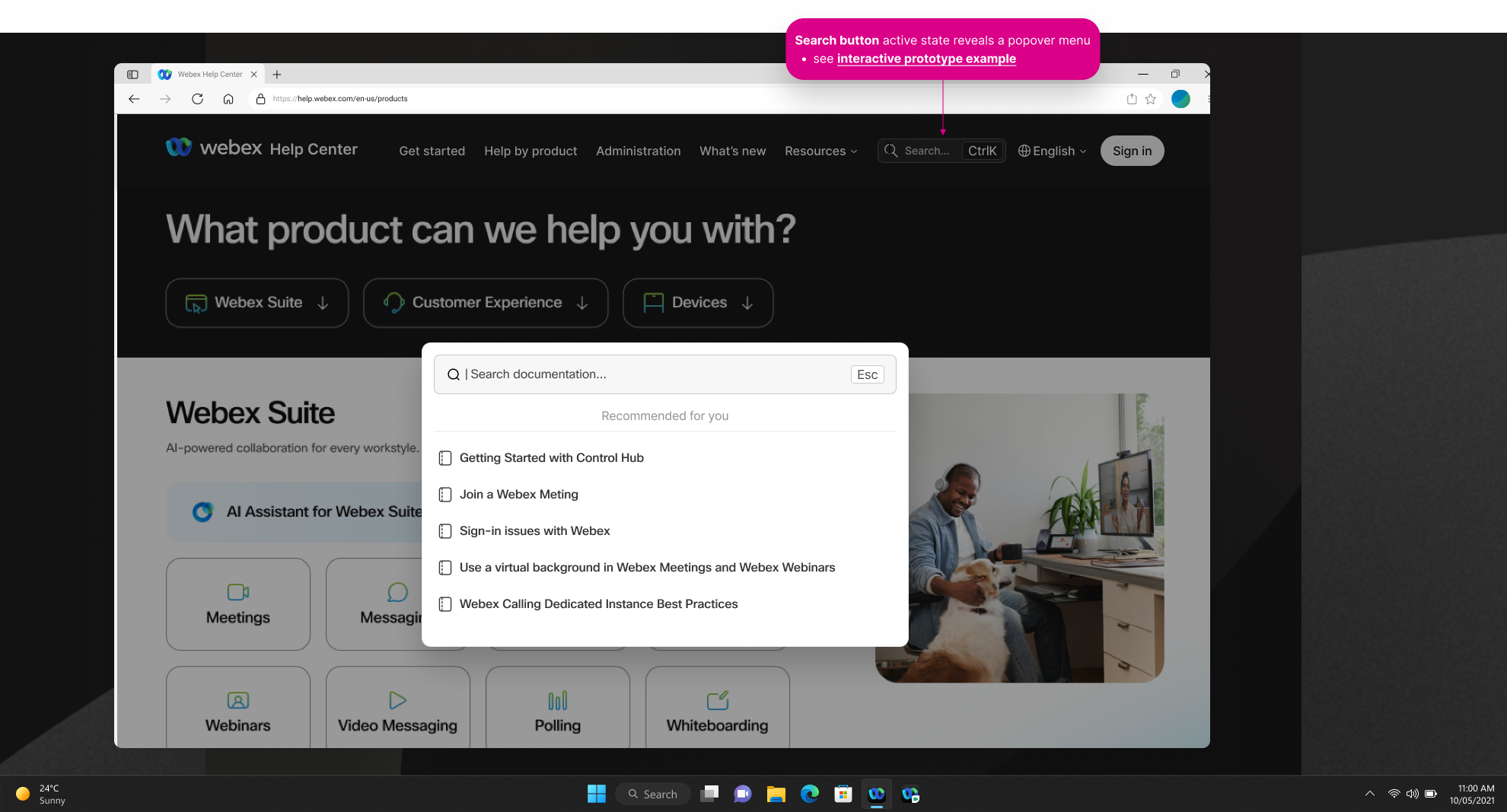
- Search button placement and interaction change — repositioned search and redesigned the interaction pattern (which led to the usability test)
- "What's new" placement change — adjusted positioning for better discoverability
The challenge was fitting 23 options into a navigation that didn't feel overwhelming. The mega-menu pattern solved this by organizing products into a visual grid with iconography — users could scan by icon or label without reading a long vertical list.
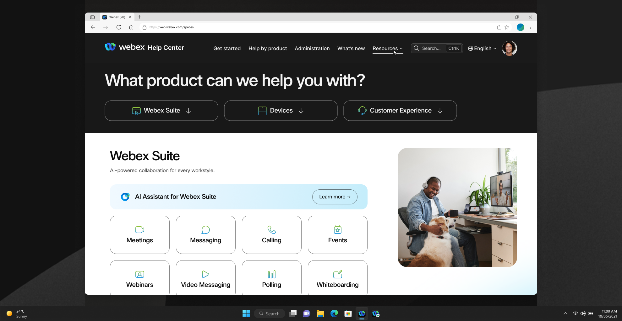
The new 'Help by product' destination page — products organized into a scannable icon grid, exposing the full Webex suite as structured navigation rather than a flat list
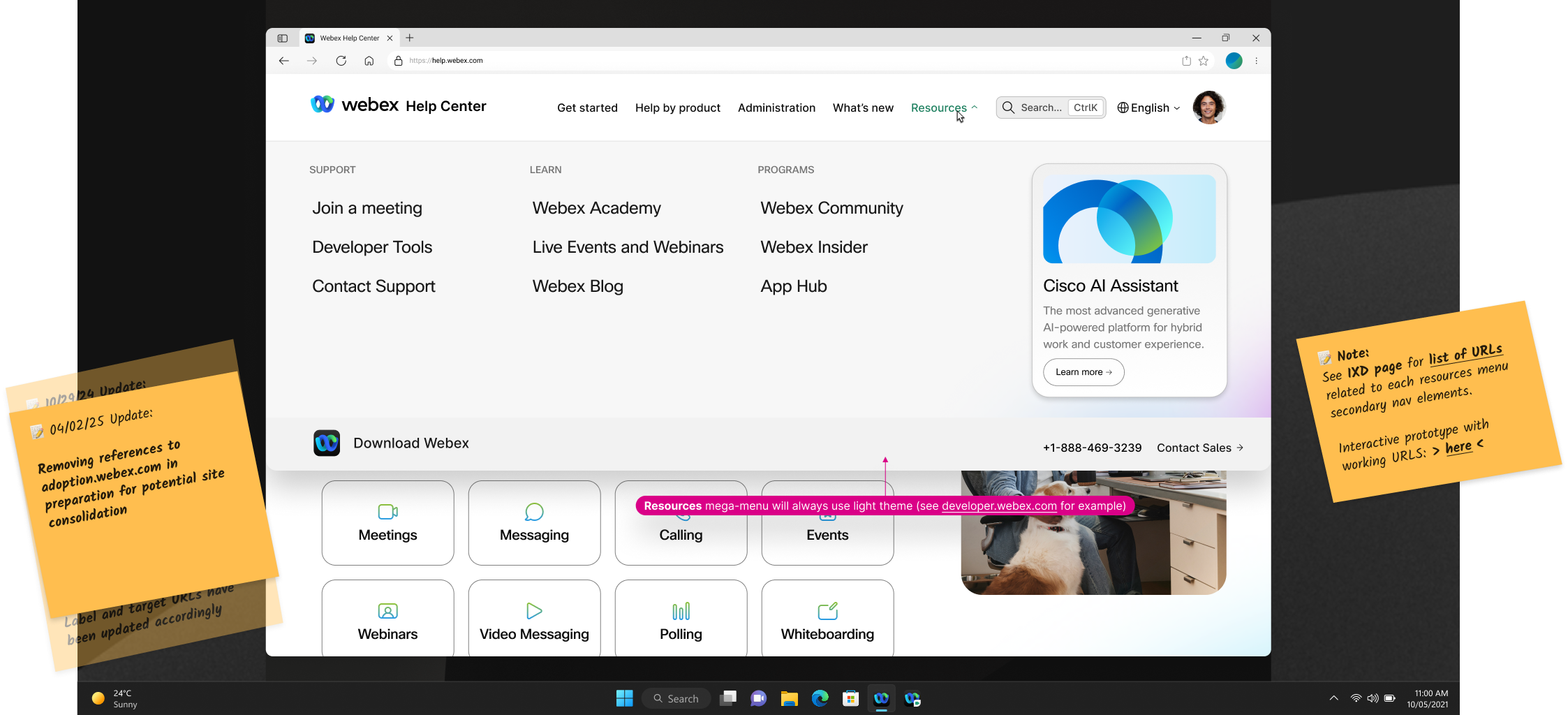
The redesigned Resources menu — adoption materials, support links, and community resources reorganized under a single umbrella with three distinct content columns
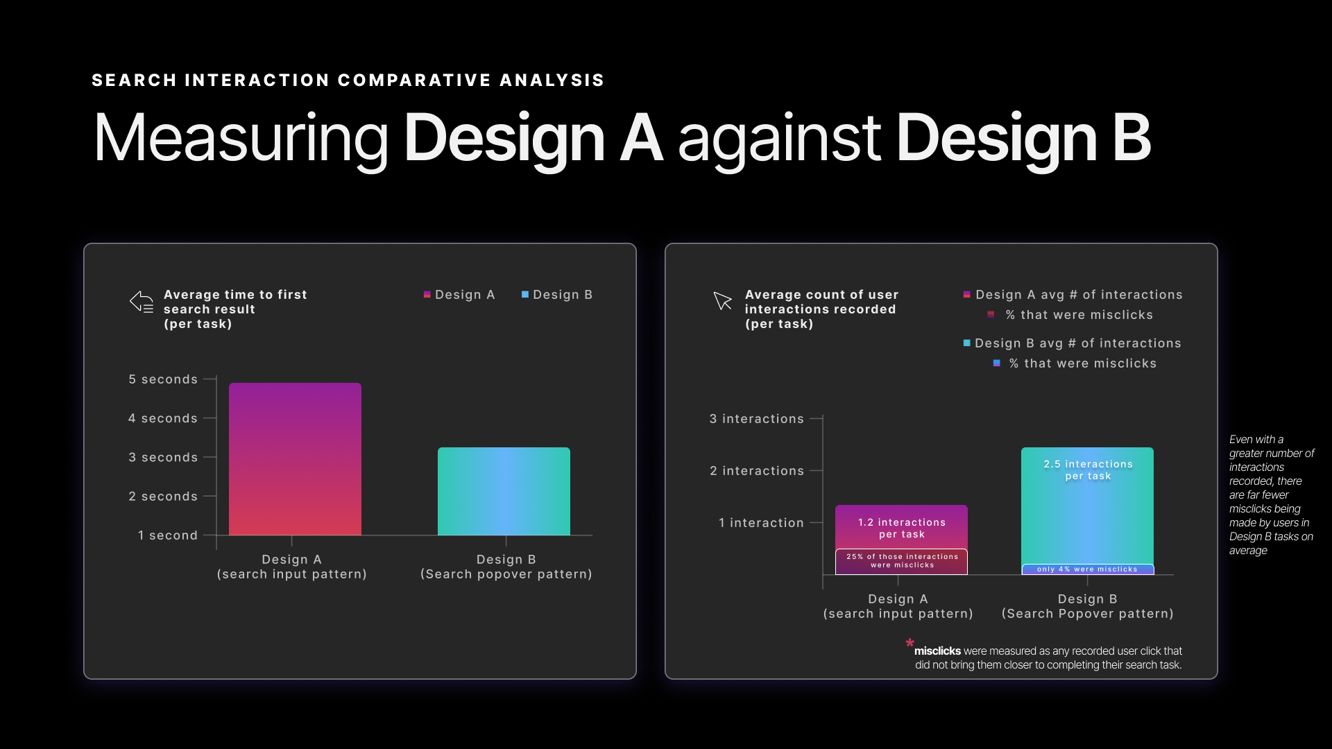
Search interaction test: two designs, four participants
With the navigation structure defined, the open question was the search interaction pattern. I designed and ran a moderated comparative usability test — 4 participants, 6 tasks, an interactive Figma prototype — comparing two approaches that differed in how and where search results were surfaced. (The internal deck labels it an A/B test; methodologically it's comparative usability testing.)
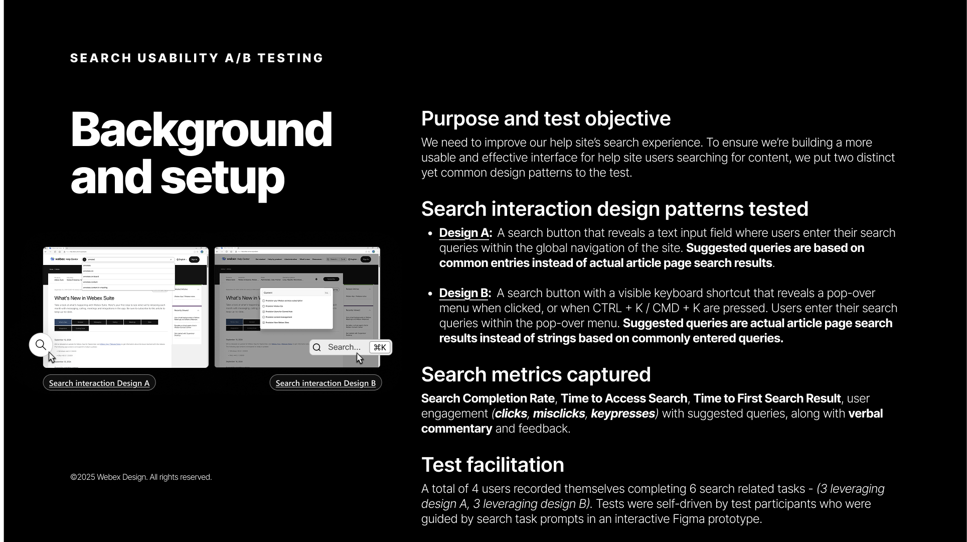
Test background and setup — two interaction patterns, four metrics, four participants, six tasks
Design A — Search via input field (existing pattern)
A search button reveals a text input field within the global navigation. Users type their query and are navigated to a separate search results page. Suggested queries are based on common search strings — popular terms, not actual articles.
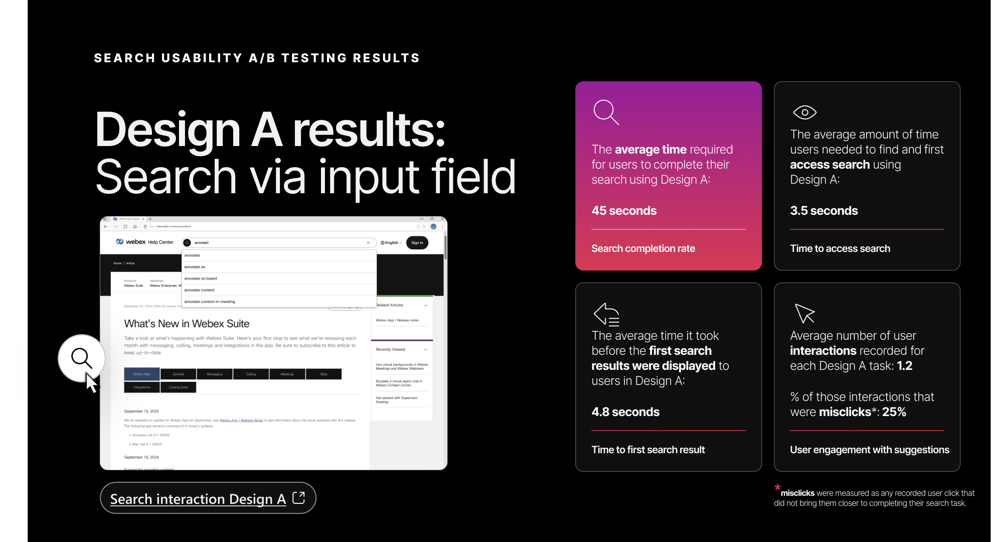
Design A results — search via input field. 45-second average completion time, 3.5-second time to access search, 25% misclick rate.
Design B — Search via popover (proposed pattern)
A search button with a visible keyboard shortcut (Ctrl+K / Cmd+K) reveals a popover menu. Users type directly into the popover and see results immediately without page navigation. Suggested queries are actual article page search results — real content, not popularity metrics.
Design B's search popover — triggered by the search button or Ctrl+K, surfacing article-based suggestions in-place without navigating away from the current page
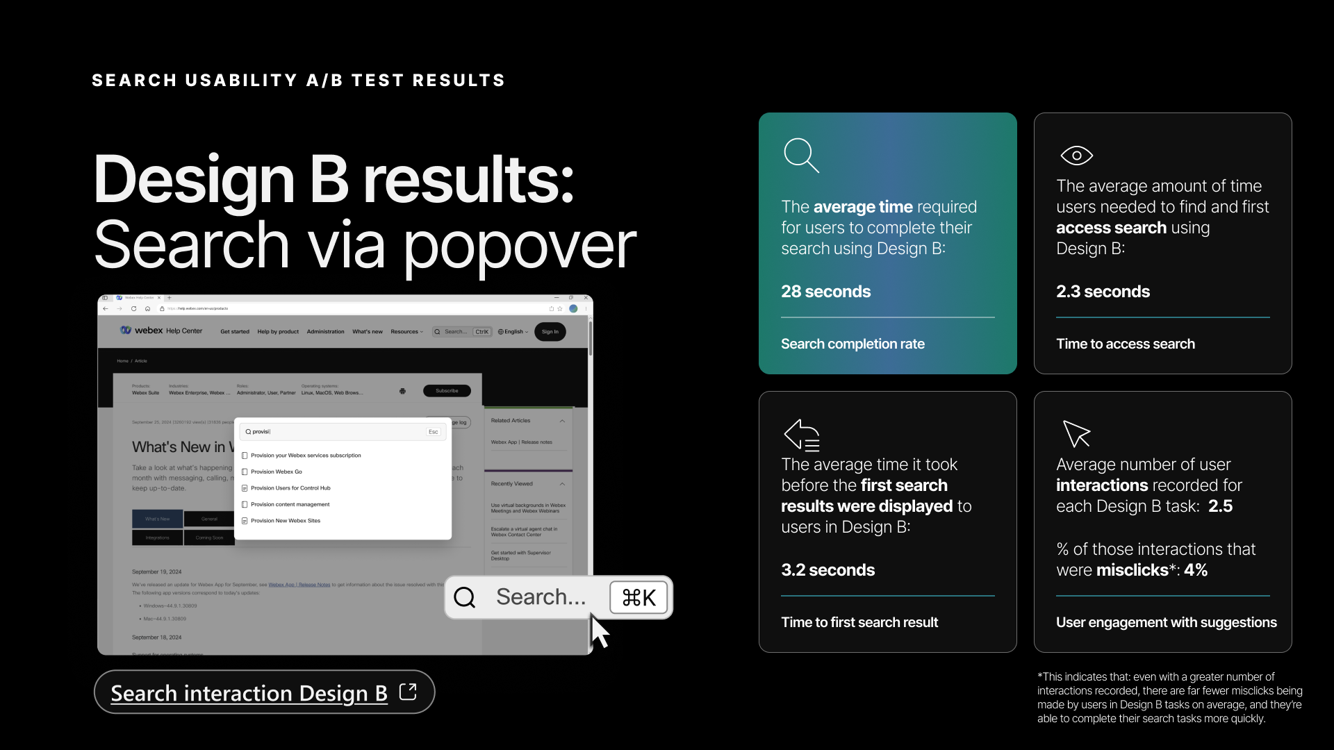
Design B results — search via popover. 28-second average completion time, 2.3-second time to access search, 4% misclick rate — every metric ahead of Design A.
Test methodology
4 Webex Experts recorded themselves completing 6 search-related tasks — 3 using Design A, 3 using Design B. Tests were self-paced, guided by task prompts in an interactive Figma prototype. I captured screen recordings and analyzed four named metrics:
- Search completion time — Average time from first accessing the interface to reaching the intended destination (the deck labels this "completion rate"; it's a time)
- Time to access search — Time to find and access the search interface element
- Time to first search result — Time from query submission to first result displayed
- User engagement with suggestions — Number of interactions (clicks, misclicks, keypresses) with suggested queries
Results
Design B (popover) won across every metric:
| Metric | Design A | Design B | Delta |
|---|---|---|---|
| Search completion time | 45 seconds | 28 seconds | 38% faster |
| Time to access search | 3.5 seconds | 2.3 seconds | 34% faster |
| Time to first search result | 4.8 seconds | 3.2 seconds | 33% faster |
| Avg interactions per task | 1.2 | 2.5 | More engagement |
| Misclick rate | 25% | 4% | 84% reduction |
The interaction data told a clear story: users engaged more with Design B (2.5 interactions vs. 1.2) but made far fewer errors (4% misclick rate vs. 25%). More engagement with less friction — the popover pattern was both more inviting and more forgiving.
Four participants is a small sample — these results are directional, and the consistency across all four metrics plus the qualitative feedback is what gave us confidence to move to implementation.
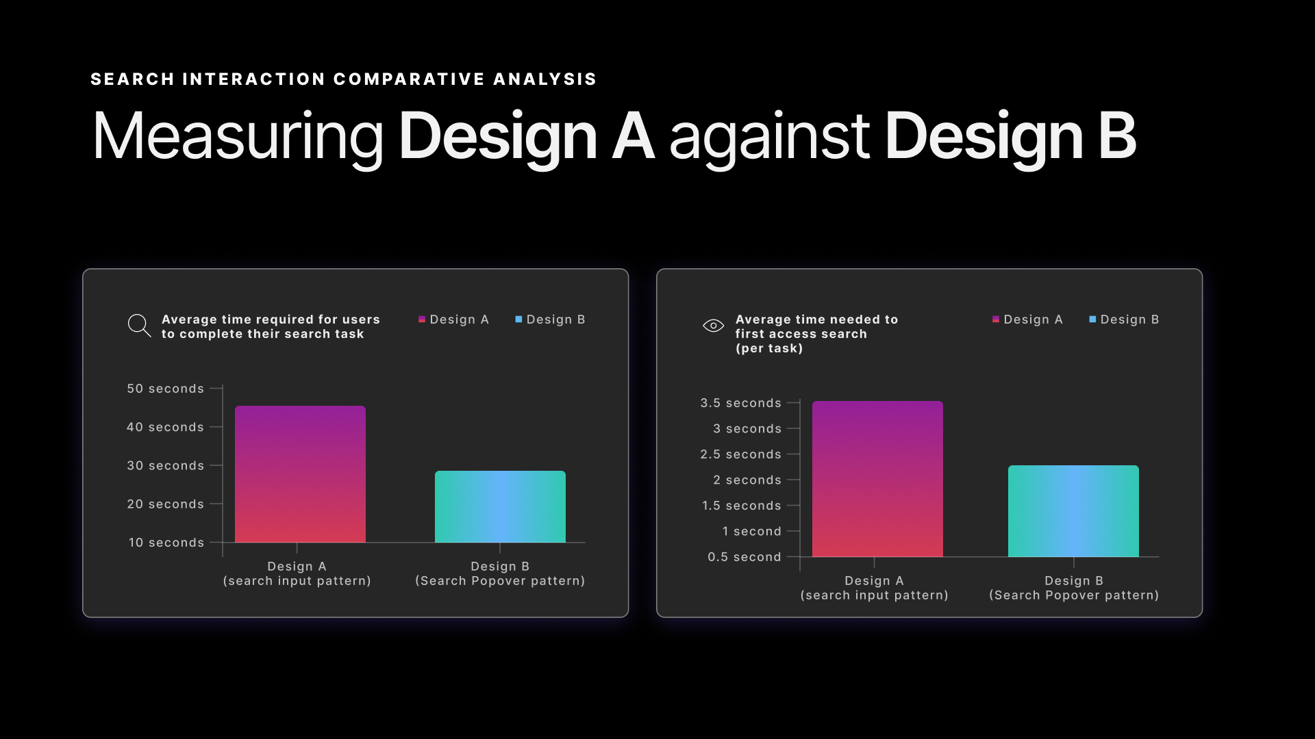
Completion time and time-to-access-search — Design B outperforms Design A on both
Time to first result and interaction quality — Design B users engaged more and erred less
Participant feedback
The qualitative feedback reinforced the numbers:
![Stakeholder quote slide labeled 'Test participant feedback on Design A: Search via input field' — large display quote reading: '[the search input pattern] feels like you have to go one step further, because you will come to a completely different page versus seeing the search results in the pop-up.' Key phrase 'you have to go one step further' is highlighted in pink.](/case-study-assets/global-nav/slides/05-design-a-quote.png)
Test participant feedback on Design A — the page-navigation penalty was the most consistently cited friction point
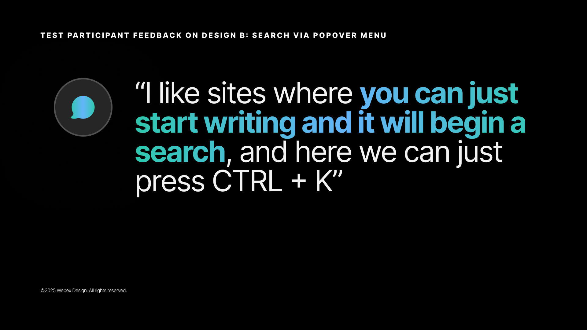
Test participant feedback on Design B — participants explicitly called out the keyboard shortcut as a valued efficiency affordance
Multiple users specifically called out the keyboard shortcut as a valued feature — a signal that the Webex Experts audience (power users, administrators) appreciated efficiency affordances. The popover pattern met an expectation that participants already brought from other tools they used daily.
Design specifications
The full interaction spec and visual design were delivered in Figma with detailed annotations covering:
- Interactive states — hover, focus, active, and keyboard navigation states for every nav element
- Search popover behavior — open/close triggers, keyboard shortcut registration, suggested query population, result item interaction
- Responsive behavior — how the navigation collapses and adapts across viewport sizes
- Visual design — updated typography aligned with the Momentum Design System, product iconography, color treatments for the hero sections
- Layout and spacing properties — precise padding, margin, and alignment values for engineering handoff
- Accessibility — keyboard navigation paths, focus ring styles, ARIA attributes, screen reader announcement patterns
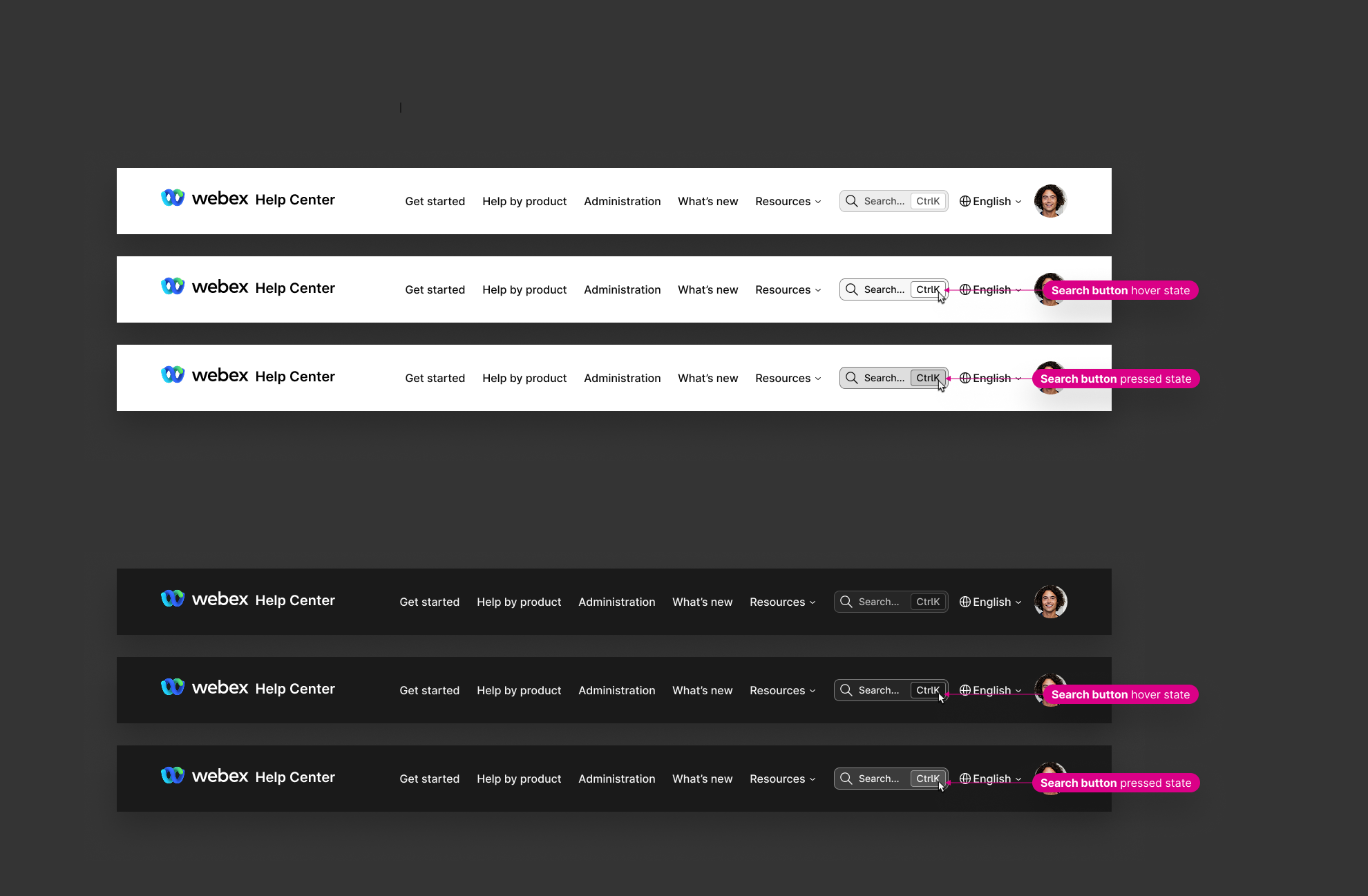
Search button interaction states — default, hover, and pressed states specified for both light and dark themes
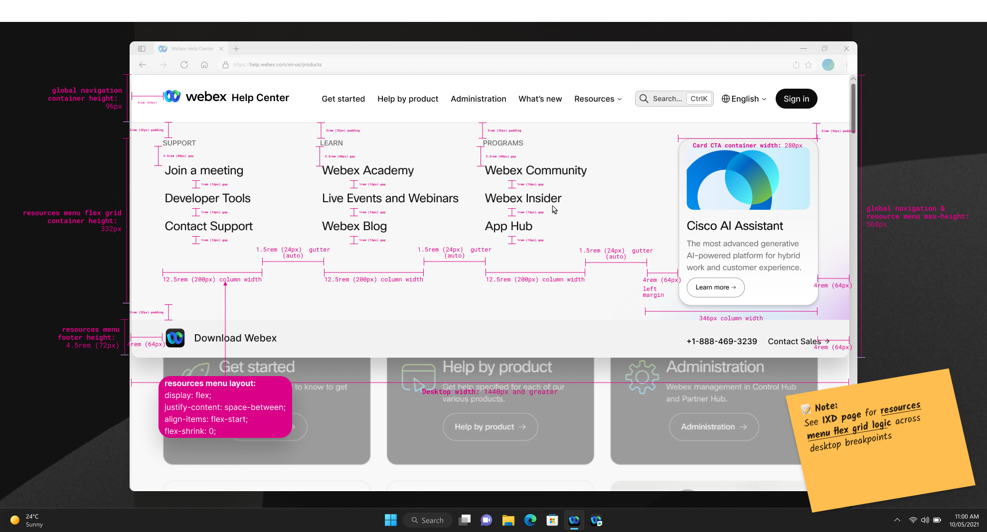
Resources menu layout specification — column widths, spacing values, and typography properties annotated for engineering handoff
Outcomes
- Shipped to production in November 2025 — the redesigned navigation and the Ctrl+K search popover are live on help.webex.com
- Exposed the full product suite in the navigation — from 8 options to 23 — without degrading search task speed in testing. (The test covered search tasks only; browsing the new IA wasn't separately tested)
- Search popover pattern won the comparative test — 38% faster task completion, 33% faster time to first result, and 84% fewer misclicks, consistent across all 4 participants
- Keyboard shortcut (Ctrl+K) repeatedly called out as a valued power-user feature by the Webex Experts participant group
- Article-based search suggestions (Design B) outperformed popularity-based suggestions (Design A) — surfacing real content trumped surfacing common queries
- Competitive parity established — the redesign brought help.webex.com's navigation and search patterns in line with enterprise help site best practices
Main findings — the popover pattern outperformed the input field pattern across all four measured dimensions; keyboard shortcuts were a standout qualitative finding
Reflection
The test reinforced what the competitive research had already made plain: we weren't solving a novel UX problem. We were closing the gap between how Webex behaved and how users already expected navigation to work, based on every other enterprise tool they opened every day.
That's a quieter kind of win. But users don't experience a product in isolation. They bring expectations from everything else they use. Removing the friction between those expectations and what Webex actually offered turned out to be more valuable than any novel design pattern could have been.